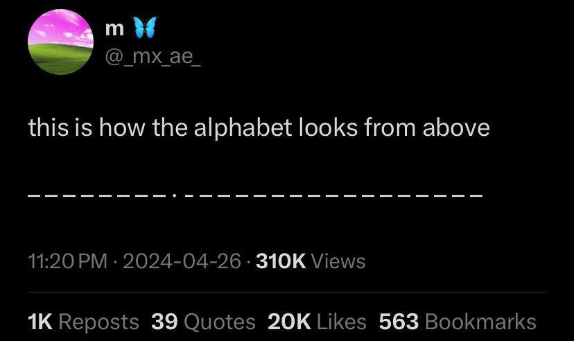
The Picard Maneuver@lemmy.world to Microblog Memes@lemmy.worldEnglish · edit-29 months agoP is for Perspectivelemmy.worldimagemessage-square20fedilinkarrow-up1430
arrow-up1411imageP is for Perspectivelemmy.worldThe Picard Maneuver@lemmy.world to Microblog Memes@lemmy.worldEnglish · edit-29 months agomessage-square20fedilink
minus-squaremanucode@infosec.publinkfedilinkEnglisharrow-up22·9 months agoM and W should be wider than the rest, shouldn’t they?
minus-squareteft@lemmy.worldlinkfedilinkEnglisharrow-up16arrow-down1·9 months agoMaybe it’s a monospaced font
minus-squarekamiheku@sopuli.xyzlinkfedilinkEnglisharrow-up5arrow-down1·9 months agoThat’s not how monospaced fonts work
minus-squaremidnight@kbin.sociallinkfedilinkarrow-up12·9 months agoThen the “i” would likely be a dash too 𝚒𝙸
minus-squarePretzilla@lemmy.worldlinkfedilinkEnglisharrow-up1·9 months agoNot if it’s allegorical Nor if they are all the same letter or same size letters
minus-squaremanucode@infosec.publinkfedilinkEnglisharrow-up1·9 months agoI and J are already different

M and W should be wider than the rest, shouldn’t they?
Maybe it’s a monospaced font
The i says otherwise.
That’s not how monospaced fonts work
Then the “i” would likely be a dash too
𝚒𝙸
em dash to the rescue! —
Not if it’s allegorical
Nor if they are all the same letter or same size letters
I and J are already different