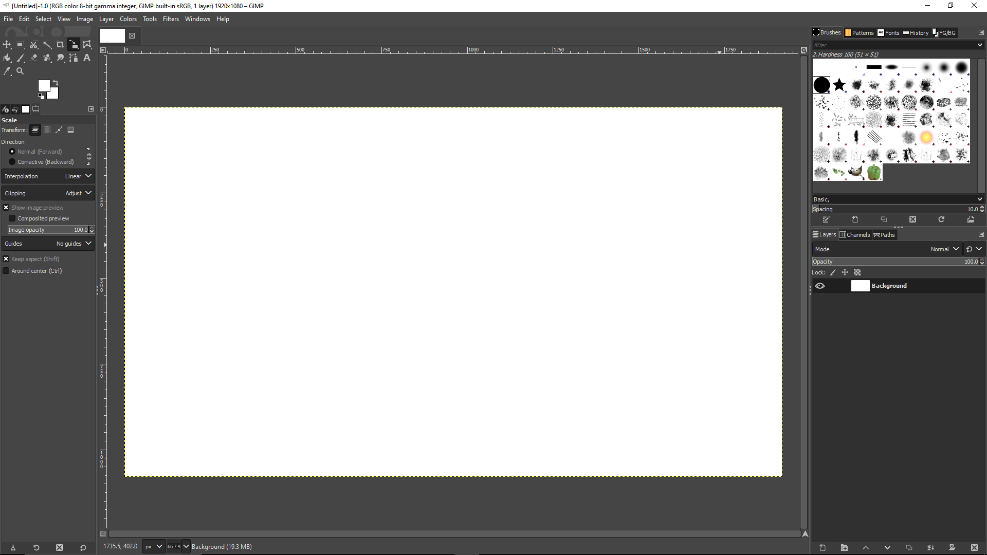
GIMP is great but it definitely needs its own Blender 3.0 moment where they just completely overhaul the UI.
I’ve used it as my primary raster app so I’m way used to it now, but I totally understand the people who just never even bother to learn it because they are so turned off by the absolutely bonkers design decisions.
The damn thing was written by a couple of College Students who had no experience with graphic arts and man does it show. The UI has been the number #1 complaint since the 1.0 release back in 1998; how it’s never been updated / overhauled is simply beyond me.
It looks good to me…

Why? Looks basically the same as photoshop, which everybody seems to love.
Among other things:
- monochrome color scheme prevents easy recognition of tools
- dozens and dozens of arcane options listed alongside super basic options
- weird sizing of buttons
- no help search, and no search that can associate synonyms where users don’t know what term to search for
- no inbuilt suggestions when user behaves strangely (eg. user is spamming the escape key, searching “deselect”, maybe suggest the deselect all hotkey?)
You can change the icon theme in the settings to a color one. That’s what I always do. The scaling can be changed as well.

May I ask what are some of the arcane options supposed to be?
I haven’t used Photoshop; learned basic photo editing in GIMP (as a poor student, I appreciated a powerful, free editor). So, no complaints about the UI from me. If anything, I’d probably bitch about the Photoshop UI if I ever used it.
One thing that concerns me a little, however, is the third-party integration with Nik Collection. The second version, which I’m still using, was provided for free by Google. They later sold the software, and the new company commercialized it. I found it difficult to track down the v2 installer, so I’m now keeping it on multiple backups, in multiple locations, as one of my most treasured software possessions.
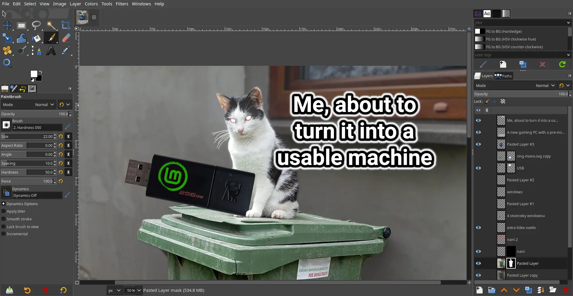
make_meme_with_imagemagick.sh --text "How CLI memers look at GUI memers" --template twilight-snobs | upload_meme_to_lemmy.shWhilst Gimp is technically powerful, you can really tell it’s made by programmers. I cannot stand the UI and shortcut defaults, but maybe I’m damaged from having used Photoshop a couple times.
Krita exists and it’s way more robust than the abomination that is GIMP
They serve different functions


