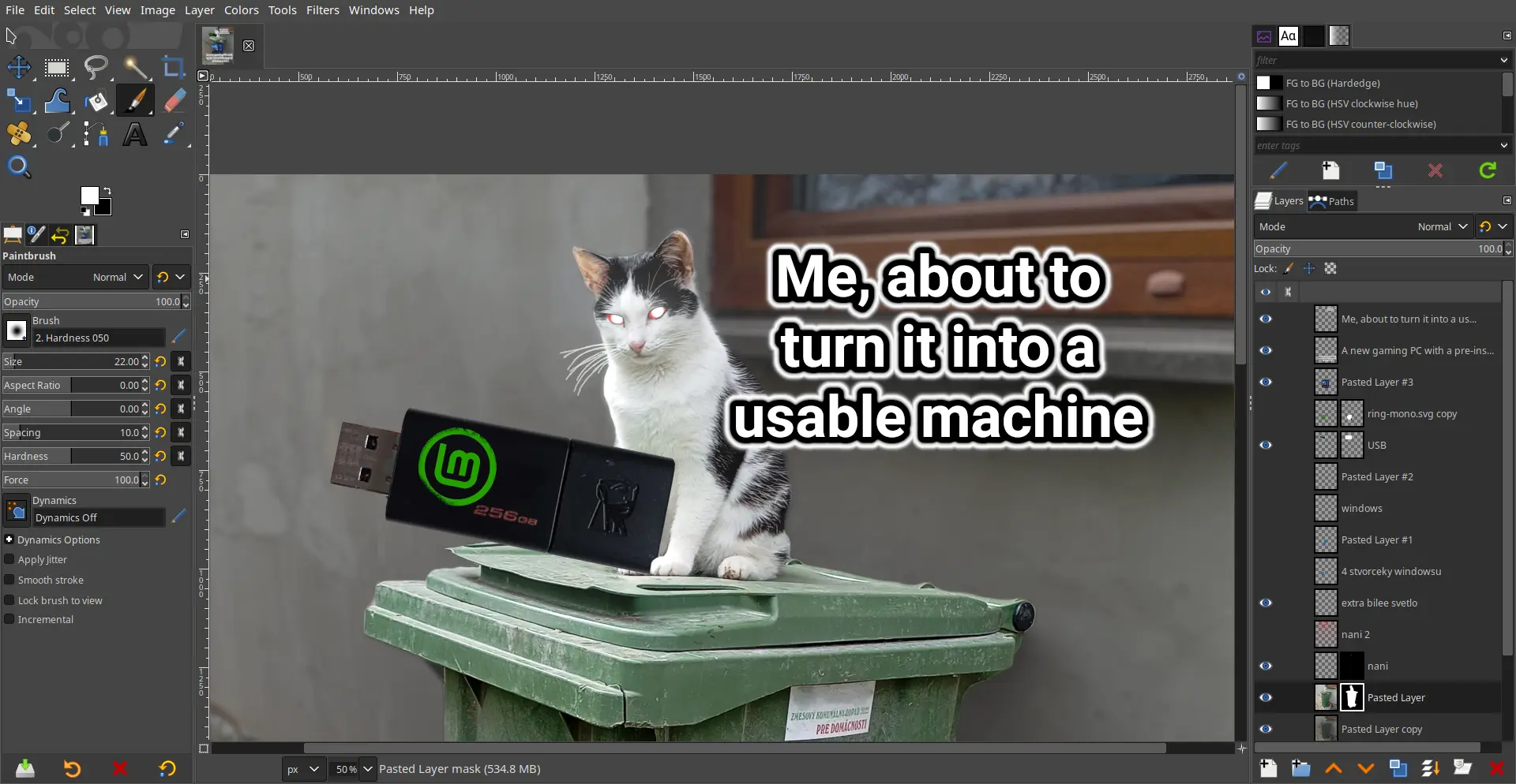
GIMP is great but it definitely needs its own Blender 3.0 moment where they just completely overhaul the UI.
I’ve used it as my primary raster app so I’m way used to it now, but I totally understand the people who just never even bother to learn it because they are so turned off by the absolutely bonkers design decisions.
The damn thing was written by a couple of College Students who had no experience with graphic arts and man does it show. The UI has been the number #1 complaint since the 1.0 release back in 1998; how it’s never been updated / overhauled is simply beyond me.
It looks good to me…
Why? Looks basically the same as photoshop, which everybody seems to love.
Among other things:
You can change the icon theme in the settings to a color one. That’s what I always do. The scaling can be changed as well.
May I ask what are some of the arcane options supposed to be?