
I guess that’s whats lost in the meme. Just because you “can” use something as collateral doesn’t mean you “are” using something as collateral. The language should be more accurate to describe actual use vs hypothetical.

I guess that’s whats lost in the meme. Just because you “can” use something as collateral doesn’t mean you “are” using something as collateral. The language should be more accurate to describe actual use vs hypothetical.

So how does taxing unrealized gains work. If I purchase stock X at a specific price. If the stock goes up and I now am holding 150% of my original value. Let’s say it hovers there for 3 more years. After 3 years it tanks and is now worth only 50% of my original purchases. Are people suggesting that I pay taxes on the unrealized gain of 50%, even though I end up selling at loss and have realized negative value. Doesn’t that mean I am being taxed on losing money? How does that make sense?


Thanks for the checking. I think the whole argument is pretty wild and specious, and factually suspect, that someone died because a person couldn’t look up the cpr video on time. YouTube is not a platform that is meant to deliver on demand life saving training. In NYC all the restaurants and workplaces have signs up in designated areas with instructions on how to do cpr. I suspect someone is going to more quickly look up written instructions or infographics if they need to Google. But really, this just speaks to the importance in staying up to date on CPR practices and having school and HR classes that teach this on a recurring basis. Using this as an argument against all ads is kind of nuts.
Also, the first step of most CPR instructions is call 911. So if you follow instructions, how are you watching a video on the phone? And can’t the operator coach you through the steps? https://www.redcross.org/take-a-class/cpr/performing-cpr/cpr-steps


I can’t tell what is more gaudy. Keeping the video the same size and overlaying an image with a transparent background, or shrinking everything with some obtrusive weird colored border to make it look like a 90’s web page. But at the end of the day, I think it’s relatively non intrusive, especially if dismissible while keeping the video paused.


Looks like the reddit embeds were newly added to the page, or weren’t loading correctly last night. Couldn’t tell those links were previews or final designs of what the ad format would look like. Disney pause ads for example have it overlayed on top of the video instead of shrinking the video to have a banner/border around it. https://variety.com/2023/tv/news/pause-ads-hulu-max-peacock-streaming-1235764850/


Proof? Aren’t there classes of videos non monetized on youtube? When I just google search for cpr and find the american red cross I quickly found written instructions as well as a youtube video that doesn’t appear to have any ads. Isn’t the problem that some video creators intentionally create videos for CPR in hopes of monetizing?


YouTube wants you to keep watching the videos. The more time you spend on the site the more ads you see. They care about finding the balance of acceptable ad load to maximize ad space, which requires a consistent user base. I have faith that this is their objective. Also, videos take time to load and a user hitting pause is unpredictable. A light weight display ad is probably the best technically feasible way to grab a user’s attention in that brief moment of hitting pause. Especially when pause means a user wants to mute audio to do things like take a phone call, a video would turn off users to the platform.


It’s the opposite. If you pause the video you the viewers are almost always looking at the screen. The pause button on a mobile phone or web browser is literally on the player. You are guaranteed to see it immediately after you push the button. You will see it when you un pause. These ads are display banners not video. It only takes a second to see the ad.
Unlike video ads that just auto play, especially when the video player auto plays more videos, there probably is more probability you aren’t actually watching, unlike pause ads that require user activity and focus on the screen to push the pause button.


Look at the article linked to it. It has a render of a pause ad being a banner that shrinks the video player somewhat, but the paused video is viewable.


I doubt they are video ads. On other streaming services they are just static images with transparent backgrounds displayed on one third of the screen or borders that show up around the paused video. Pause ads aren’t new and I’m guessing YouTube is following other streaming services.

Yes, they are standing to board. Because the NYC train station is under ground (tunnels are needed to get under the river, the platform is also under ground like a subway. The platform for the tracks are very narrow. So a train will come in, it will disembark all passengers and change crew. During this time above ground passengers get in line to present tickets. They then walk downstairs to the platform and board the train. But because the platform is underground and relatively small, it is not a comfortable or safe place to wait to board while guests disembark.
Platform for amtrak at Penn Station/Moynihan: 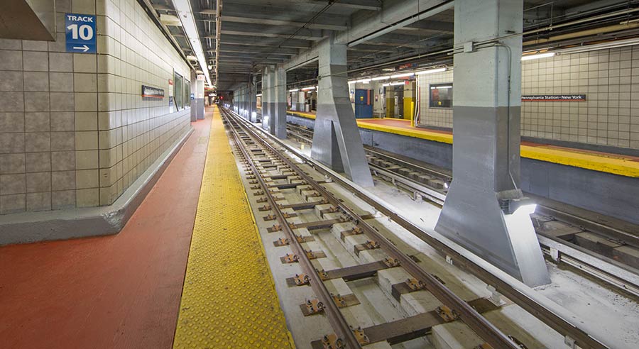
I think that is correct about consider Amtrak like an international train like SNCF in France to TGV. It’s passenger focused, but generally for longer trips with people carrying luggage. We also have regional/commuter trains for rides less than ~90 minutes meant to get people to work in the city.
For seating, it’s somewhat limited because of the size of the station, but it’s also right in the middle of new york city. If you are looking to sit for an extended period of time and the weather is nice, there’s public seating at bryant park or the squares or blocked off seats on broadway outside of times square. But NYC doesn’t have a ton of space, and the train station is designed to prioritize the train passengers.

Nice thing about NYC is that housing is a right based on the Callahan v. Carey ruling. Every person that asks for temporary shelter is supposed to have access to it. It’s not perfect, doesn’t have the funding or capacity to deal with the bussed in migrants, but it’s better than most cities/states. And it does more to address the issue directly than viewing benches as a crutch for the problem.
But re the engineer question, I think Moynihan probably had a lot of engineers. And safety, security, egress, congestion, etc were considered in the design which is why they put seating around the perimeter and not the center of the hall.

That is dangerous in NYC. Penn/Moynihan Station is a terminating station. I’m guessing over 60% of the train capacity often unloads at Penn/Moynihan Station (assuming NE corridor from DC with stops in philly and other towns along the way). You can’t have passengers waiting to board obstruct that many people disembarking on a narrow platform. You’re thinking of suburban train stations that just quickly pass through, not a major urban station. Also, because it’s amtrak there’s a lot of luggage being carried which needs more space. Not to mention room for dedicated luggage service to move bags to baggage claim.

“not enough” is completely different than saying non existent. Moynihan is the most trafficked Amtrak station in the US with more ridership than DC and Philly combined. Yet the size of the station is comparable to the stations in DC and Philly. Thank you MSG for destroying the Old Penn Station.

deleted by creator

The layout is different in philly. Train stairs are on the sides of the main hall, not in the center of it. The center of the main hall is clear of seats to allow traffic to come through. The design of moynihan puts the stairs to the tracks in the middle of the hall, not the sides of the hall. So the seating options are put near the side to allow more flow of traffic in the center of the hall. I’m also pretty sure this is also a result of modern anti-terrorism design to be easier for security as well. Seating exists for waiting. At Moynihan they don’t really announce what track your train will be on until like 5 or 10 minutes before boarding starts. So there’s not really a way to know where to wait for ‘your’ train even if benches were next to the tracks.
Also, 30th St Station in philly has less than half the annual amtrak ridership as Moynihan, but roughly the same size building.

Look at a station map or visit the station. When you have 2 or more trains boarding near simultaneously the queue to get down the the platform level is pretty long and snakes. There’s a difference between waiting for a train at a terminating station where you don’t know the the track assignment vs boarding a train at a non terminating stop or minor station where the is no grand hall. Moynihan has underground non open air platforms so you need to keep people waiting above in the hall since there’s not a lot of room at platform level.
This is the map:
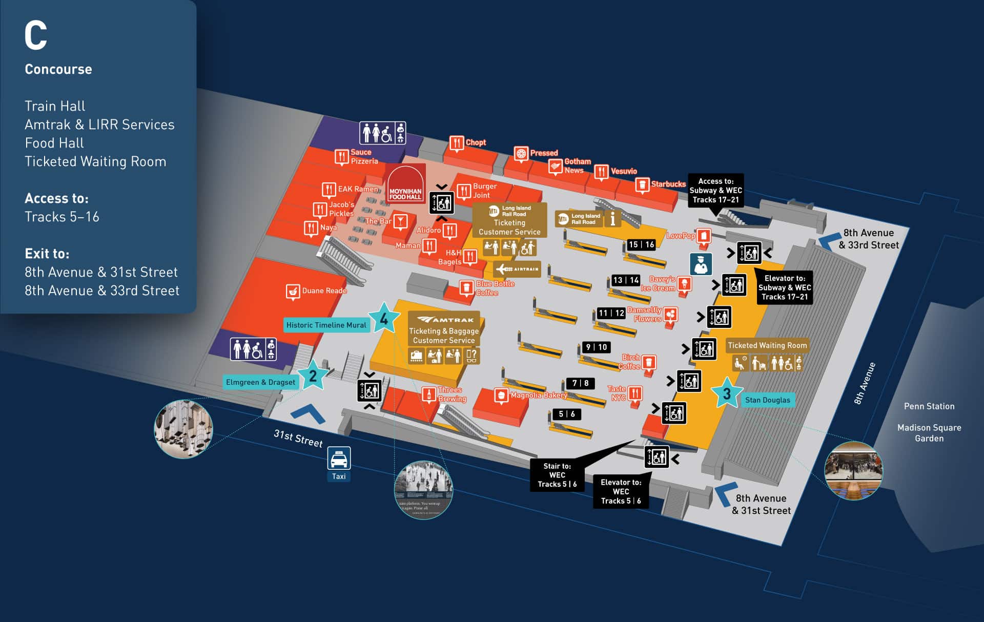
See that area on the right called ticketed waiting room? That is where everyone with a train ticket can sit at a bench/chair or grab a table/desk to do some work. On the other side there is a food hall. As someone that travels out of that station regularly, I think the design totally makes sense based on the size, amount of foot traffic, and etc. If I need a place to sit before my train boards, I know where to sit.
The waiting area with seats: 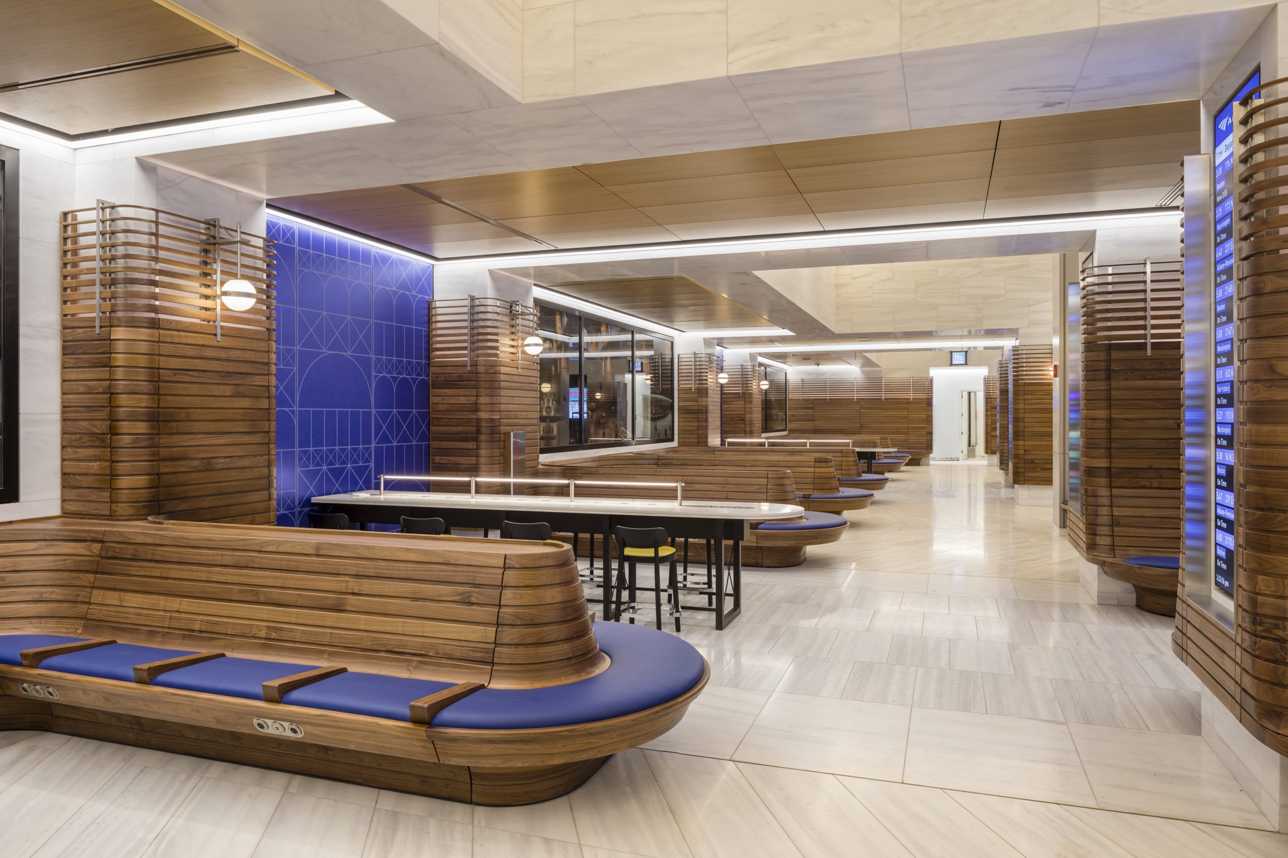
These are the one way escalators that you don’t line with benches where people queue to get up. You don’t want people sitting and possibly blocking the escalators either.
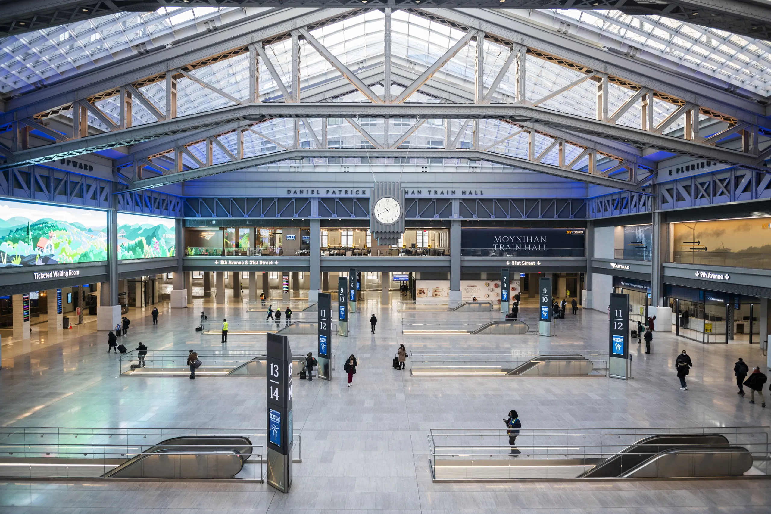
The real crime here to complain about is that the Old Penn Station was destroyed to put in a MSG. We have a stadium at the expense of a well designed train station. Moynihan being built next door on a small footprint really was a breath of fresh air to a terrible train station. You don’t get situations like this in Moynihan: https://www.westsidespirit.com/binrepository/576x432/0c0/0d0/none/3502612/ODJP/penn1_4-3802539_20211210112648.jpg
Instead you get this queue for 1 train boarding on track 13/14. (it is worse if there’s multiple trains boarding simultaneously):
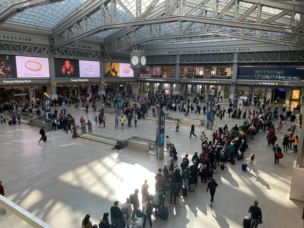 If there are multiple simultaneous boardings, I am not sure if they use space between escalators to snake the line instead of wrapping around all escalators (at times I do see some of those lane rope things in use to encourage people to no clog up the middle to foot traffic) That does not compare to a minor philadelphia suburb platform where you wait on the platform because the already full train isn’t going to stop for more than 2 minutes to pick up a few passengers. That would be a massive safety risk to allow this kind of seating on platform in NYC rail system with underground platforms. And this is not even considering how to move people off a train before moving the next group on the train. Also crew changes since NYC is a terminating station for a lot of lines.
You can have folks queuing up and still have a lot of room for people to navigate through the main hall. Probably as a much a security and anti-terrorism feature as well as a design to not obstruct boarding or create bottle necks for emergency egress.
I don’t think you’ll find many new yorkers complaining about a lack of seating in Moynihan right on the main hall where all the foot traffic is. We like it when people get the fuck out of our way while we try to get from point A to B.
Edit: also I don’t think people understand the scale of NYC’s population and train rider ship. Moynihan ridership is 8 million annually. 2nd place is DC with 3.6 million. Moynihan is a amtrak only station so it’s built for luggage, but even then Moynihan is probably a smaller station than either DC or Philly, yet has over double the ridership. I don’t think folks appreciate how much traffic goes through a relatively small train station, but I think that factors into the design of NYC stations vs any other picture you have of spacious stations that have less than half the ridership in buildings of comparable size.
Edit 2: In this thread people that don’t understand the difference between Amtrak, regional commuter trains, or subways, or the difference between urban vs suburban stations, above ground vs underground stations, and the fact that NYC has over double the annual amtrak ridership than the 2nd and 3rd most used amtrak stations. Not to mention, NYC has tons of benches and public seating. Sections of broadway are closed down with chairs and tables out, bryant park isn’t too far away with tons of public seating. Not surprised that the small train station is designed to have seating options only for riders of the train.

Guys. I am pretty sure that is Moynihan train station next to Penn Station. People sitting on the floor are literally leaning against the stairs down to the track. Thats is where people lineup to go on the train when it arrives at the station. Of course you don’t put benches there. In this station there is a seating area where all you need to do is show your train ticket. On the other side there’s a food hall with lots of public seating. There just isn’t seating directly where all the foot traffic is. I take trains in the North East corridor on Amtrak somewhat often. There’s seats there. Just not where seating would obstruct movement on and off the train platforms.


Yeah. I never understood why DEI required a discreet team. It seems like it should just be a function, commitment, and initiative of HR.
“can” vs “do” are different things. The meme quote describes hypothetical use, not actual use, as being something that should be taxable.